
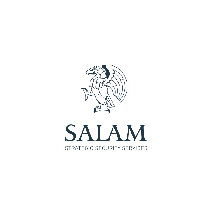
SALAM SECURITY, 2007
Designed to specifically project the superior strength and serious nature of the security business. Through illustrating the strategic position of the mythical eagle defending his eaglets, the emblem for Salam Security shouts out, "ready for anything."
Designed to specifically project the superior strength and serious nature of the security business. Through illustrating the strategic position of the mythical eagle defending his eaglets, the emblem for Salam Security shouts out, "ready for anything."
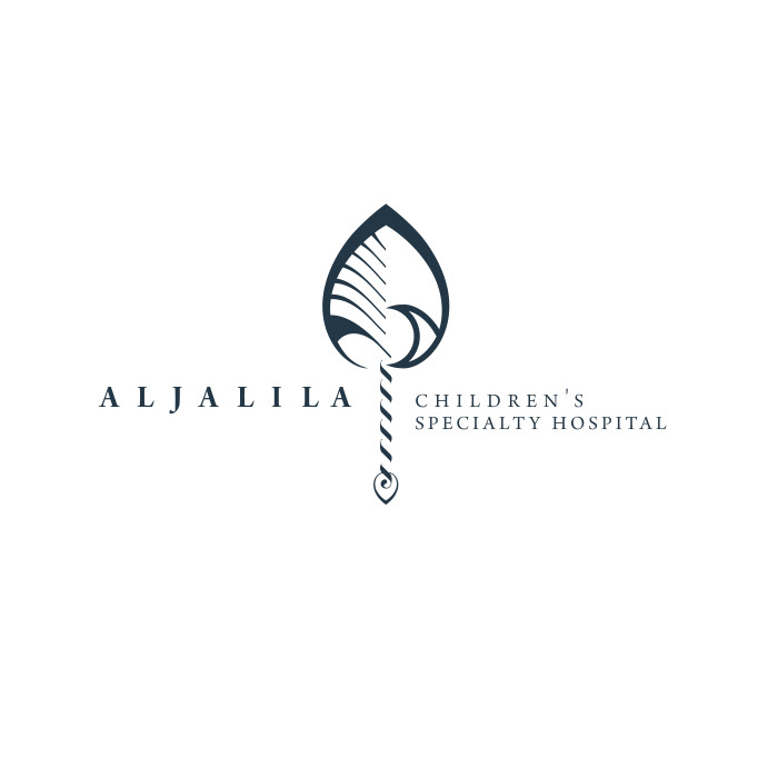
AL JALILAH CHILDREN’S SPECIALTY HOSPITAL, 2008
HRH Shaikh Mohammad Bin Rashid and HRH Haya Bint Al Hussain conducted an international competition to create the identity for the new hospital. We were honored when our logo design was selected. The meaning behind this logo is femininity, maternity, and sacred responsibility. The golden ratio is used to balance the whole composition, making this humble emblem charming for all time.
HRH Shaikh Mohammad Bin Rashid and HRH Haya Bint Al Hussain conducted an international competition to create the identity for the new hospital. We were honored when our logo design was selected. The meaning behind this logo is femininity, maternity, and sacred responsibility. The golden ratio is used to balance the whole composition, making this humble emblem charming for all time.
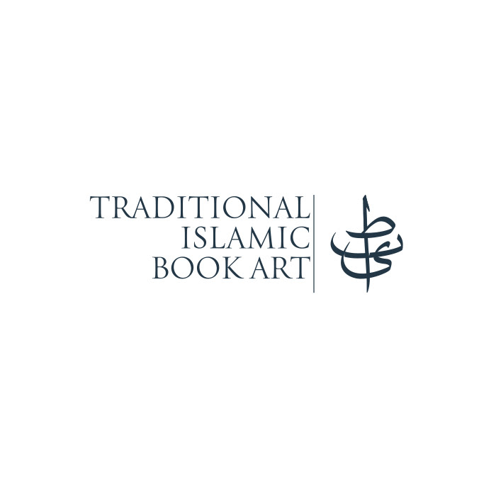
TIBA FOUNDATION, 2008
TIBA, which means goodness and stands for Traditional Islamic Book Art, is the only foundation of its kind in the Middle East. It was founded by HRH Princess Haya Bint Al Hussein to produce three magnificent copies of "Mus'haf" (the written Qur'an). Every page was prepared, calligraphed, and illuminate with gold, and later hand-bound by the masters of their domains. The logo design for such a perfect idea and content could not be anything less than perfection. The result preserves the ideal letterform of "Muhaqaq" calligraphy while expressing the logotype's unique personality.
TIBA, which means goodness and stands for Traditional Islamic Book Art, is the only foundation of its kind in the Middle East. It was founded by HRH Princess Haya Bint Al Hussein to produce three magnificent copies of "Mus'haf" (the written Qur'an). Every page was prepared, calligraphed, and illuminate with gold, and later hand-bound by the masters of their domains. The logo design for such a perfect idea and content could not be anything less than perfection. The result preserves the ideal letterform of "Muhaqaq" calligraphy while expressing the logotype's unique personality.
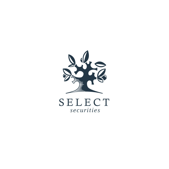
SELECT SECURITIES, 2009
Many hidden opportunities surround us, and many hunters waiting for them. The founder of Select Securities describes what they do as "revealing those investment opportunities to corporations or individuals who wanted to broaden their portfolios." Life is similar to a tree full of fruits hidden under big leaves just waiting for us to collect them. A contemporary-looking emblem with a warm feeling illustrated the concept.
Many hidden opportunities surround us, and many hunters waiting for them. The founder of Select Securities describes what they do as "revealing those investment opportunities to corporations or individuals who wanted to broaden their portfolios." Life is similar to a tree full of fruits hidden under big leaves just waiting for us to collect them. A contemporary-looking emblem with a warm feeling illustrated the concept.
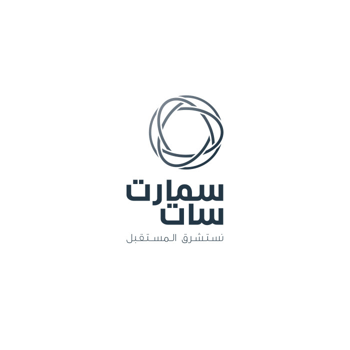
SMARTSAT, 2009
Being tasked to create an identity for the first private Arabic satellite was a unique challenge. As the satellite was based on the latest technology, it seemed natural to develop a logo and visual identity, paying homage to the earliest scientific Islamic minds who pioneered Astrolabe. Later, by illustrating the stars' paths, they inspired Muslim artists to design special Islamic geometrical ornaments. This logo intends to simplify these meanings with an artificial moon shape in sky tones graduating from day to night.
Being tasked to create an identity for the first private Arabic satellite was a unique challenge. As the satellite was based on the latest technology, it seemed natural to develop a logo and visual identity, paying homage to the earliest scientific Islamic minds who pioneered Astrolabe. Later, by illustrating the stars' paths, they inspired Muslim artists to design special Islamic geometrical ornaments. This logo intends to simplify these meanings with an artificial moon shape in sky tones graduating from day to night.
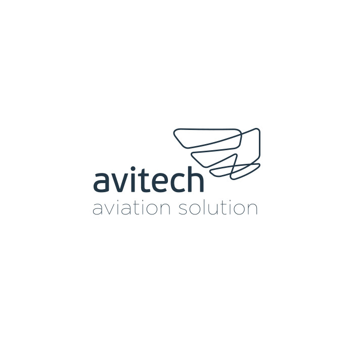
AVITECH, 2010
An endless line that seems to represent flight itself. This fresh logo treatment for the trading company Avitech, which provides additives for aviation motors, makes a clear promise to their clients that the engine will take off and run uninterruptedly.
An endless line that seems to represent flight itself. This fresh logo treatment for the trading company Avitech, which provides additives for aviation motors, makes a clear promise to their clients that the engine will take off and run uninterruptedly.
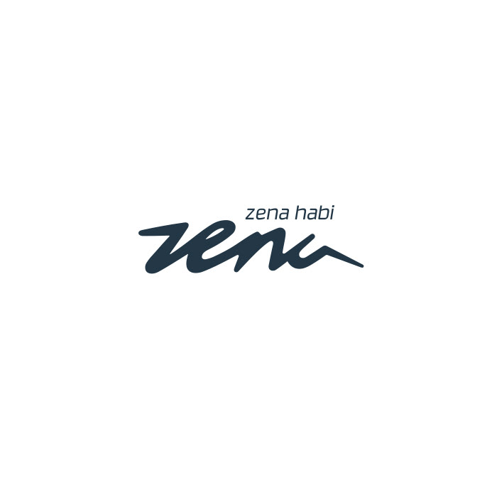
ZENA HABI, 2010
Extremely feminine and yet highly energetic, Our design for the personal identity of Zena Habi, Reebok representative for the Middle East, embodies her unique personality and attitude toward life.
Extremely feminine and yet highly energetic, Our design for the personal identity of Zena Habi, Reebok representative for the Middle East, embodies her unique personality and attitude toward life.
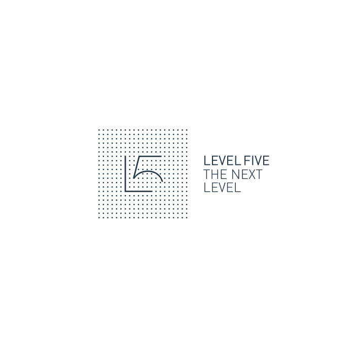
LEVEL FIVE, 2011
This interior design firm, with its contemporary portfolio, commissioned OVERHAUL for a rebranding job. The art direction was inspired by their professionalism, accuracy, and industry-leading respect for and attention to detail in everything they do, dot by dot.
This interior design firm, with its contemporary portfolio, commissioned OVERHAUL for a rebranding job. The art direction was inspired by their professionalism, accuracy, and industry-leading respect for and attention to detail in everything they do, dot by dot.
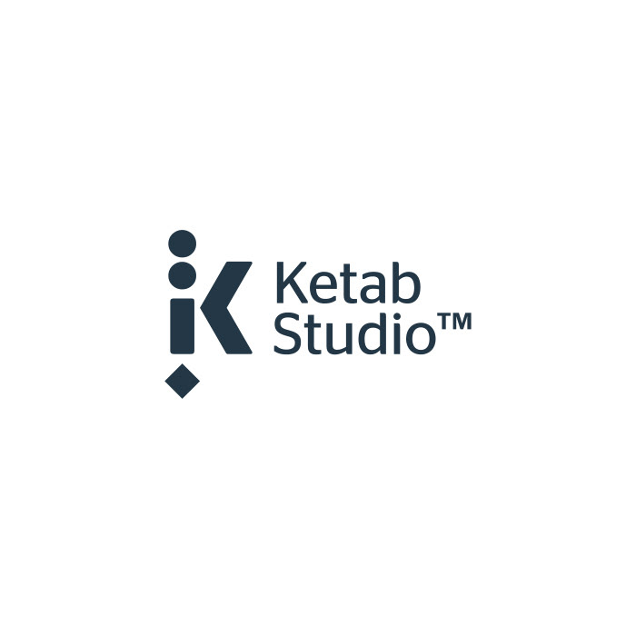
KETAB STUDIO, 2012
It's always hard to design a bilingual logo, especially when the brief says, "it should look simple, contemporary, and unique." You know if you do it, the result would be very special! Ketab Studio is a smart board software aimed at schools in the Middle East. The Arabic word Ketab means book and is better shown in its own language script. However, for a brand that wanted to be recognized internationally, Latin letters couldn't be omitted from the emblem. In this logo, we combined all the Arabic letters of Ketab in its Latin "K," as illustrated here.
It's always hard to design a bilingual logo, especially when the brief says, "it should look simple, contemporary, and unique." You know if you do it, the result would be very special! Ketab Studio is a smart board software aimed at schools in the Middle East. The Arabic word Ketab means book and is better shown in its own language script. However, for a brand that wanted to be recognized internationally, Latin letters couldn't be omitted from the emblem. In this logo, we combined all the Arabic letters of Ketab in its Latin "K," as illustrated here.
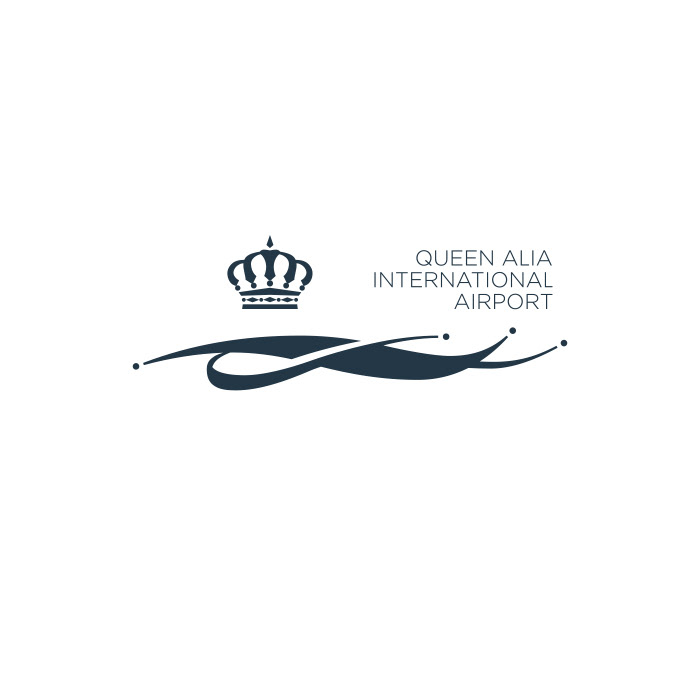
QUEEN ALIA INTERNATIONAL AIRPORT, 2014
It was a competition that we didn't know about until it was too late to participate. We talked to the authorized department and managed to get 24 hrs to present the design. It was the fastest logo we've ever designed. Yet the longest period we've ever waited for feedback, as the logo had to be approved by his Majesty King Abdullah II. We waited for 18 months until the royal court came back to us with the good news that the work has been honored. That was the start for another journey! to design a comprehensive visual Identity for the newest and biggest Airport in Jordan!. Read the logo rational and details here
It was a competition that we didn't know about until it was too late to participate. We talked to the authorized department and managed to get 24 hrs to present the design. It was the fastest logo we've ever designed. Yet the longest period we've ever waited for feedback, as the logo had to be approved by his Majesty King Abdullah II. We waited for 18 months until the royal court came back to us with the good news that the work has been honored. That was the start for another journey! to design a comprehensive visual Identity for the newest and biggest Airport in Jordan!. Read the logo rational and details here
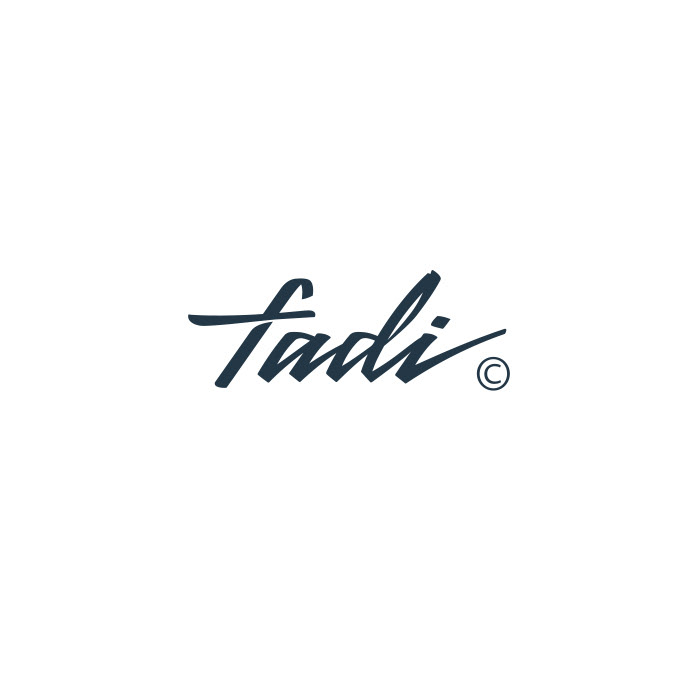
FADI AABIDI, 2015
A businessman, a pilot, scuba diver, falconer, deer hunter, and a photographer; all in one man! This superman commissioned us to design his personal logo. The logo needed to reflect his energetic, ambitious personality yet his high appreciation for art and design. We created these unique letters for the legendary Fadi Aabidi.
A businessman, a pilot, scuba diver, falconer, deer hunter, and a photographer; all in one man! This superman commissioned us to design his personal logo. The logo needed to reflect his energetic, ambitious personality yet his high appreciation for art and design. We created these unique letters for the legendary Fadi Aabidi.
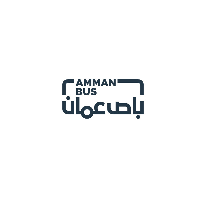
AMMAN BUS, 2019
This logo combines Arabic and English typography within the shape of a bus, making it easy for everyone to read, even the illiterate. Watching our logo moving around in our beloved city Amman, and interacting with our big family is one of the greatest encouragements to keep up the hard work!
This logo combines Arabic and English typography within the shape of a bus, making it easy for everyone to read, even the illiterate. Watching our logo moving around in our beloved city Amman, and interacting with our big family is one of the greatest encouragements to keep up the hard work!
KARMEH DESIGN STUDIO, 2020
Two very talented interior designers, Lubna Badran and Ernest Saqa, came to us with a ready sketch for what they wanted when rebranding their studio! No doubt the job was far from easy. To overcome the optical balance in this very tricky shape, it took the team over 15 revisions to shape up this elegantly balanced form and satisfy our friends.
Two very talented interior designers, Lubna Badran and Ernest Saqa, came to us with a ready sketch for what they wanted when rebranding their studio! No doubt the job was far from easy. To overcome the optical balance in this very tricky shape, it took the team over 15 revisions to shape up this elegantly balanced form and satisfy our friends.